A design + analog printing studio in Los Angeles

journal

design + letterpress printing in Los Angeles, California

Posts tagged teal
Ashley Donohue's Business Cards

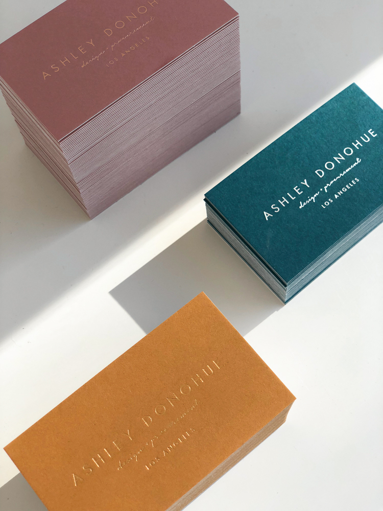
Well done business cards are an investment and you want to get done right. Interior Designer, Ashley Donohue, first came with a handful of color swatches to choose from. Instead of choosing one scheme to print, we chose them all! The trio of colors worked so well together. Put two creatives together (imagine us on the phone going back and forth on color + finishes), and this is what happens. We couldn't decide on only one.

During production, the logo side was originally slated for white ink on colored paper. The teal colored card shows this original idea with a silver - white foil with a subtle metallic sheen. For the other cards, we selected foils in a similar tone as the paper to match the dusty rose + marigold colors. The information side of the card has both a blind debossed logo + info in the coordinating ink. Both side were mounted together to make a sturdy card, about 200#, not too thick.

We went the extra mile for Ashley and the outcome is an inseparable trio of cards.

ADonohue_PresshausLA-1.jpg
ADonohue_PresshausLA-2.jpg
ADonohue_PresshausLA-7.jpg
ADonohue_PresshausLA-3.jpg
ADonohue_PresshausLA-6.jpg
robin & johanna's wedding suite

Robin and Johanna let me run with it. Basically, they trusted me to create their wedding invitations.

Some background- my husband has been long time friends with Robin, and since we've been together, I've had the pleasure of knowing them before the process of creating wedding invitations. We knew them before they were even engaged!

With a ring on her finger now, Johanna asked me if I could help with her invitations. She had a few things on the prerequisites- colorful and bright with watercolors, not formal and one more thing- could you incorporate spam musubis? 
**Record scratch**  
Come again? A wedding invitation with Spam Musubi, the Hawaiian snack food with meat from a can
Yep.

Luckily, Richard and I had planned a trip to Hawaii to do some real R&D. We were on a mission to taste the hype around these musubis. You see, this couple are foodies. Whenever they like something, you know it's going to be good and they go beyond the restaurant and even learn how make it at home. They're those folks. 

Maybe it was the vacation effect, the beach only feet away, and the shining sun but man, those musubis from Iyasume were amazing! I was sold. We ate them almost everyday after that.

We came back inspired. We knew the magic of the spam musubi and knew the exact vibe they wanted for their invitation. Since this snack is so simple, we wanted to make a recipe as a bonus keepsake.

We played with watercolors on the side too. The Lettra paper holds up pretty well. Doesn't buckle too much but it really absorbs fast. We thought it would be cute too to keep the food illustrations for the RSVP card. A California roll seemed appropriate for their California reception party.

Only Robin and Johanna would have a one of a kind, colorful wedding invitation with spam musubis. I'm so pleased they're happy with how these turned out!


Everything was created by Presshaus LA with lots of love
- design
- print
- watercolor
- illustrations
- calligraphy

robinjohannawedding_006.jpg
robinjohannawedding_003.jpg
robinjohannawedding_005.jpg
robinjohannawedding_031.jpg
robinjohannawedding_035.jpg
robinjohannawedding_036.jpg
robinjohannawedding_044.jpg